
problem
outcome
team
Strategy
Product Manager
tactics (me)
Product Designer
implementation
Product Engineers
Creative Technologist
CX Manager
Marketing Manager
timeline
1 month

challenge
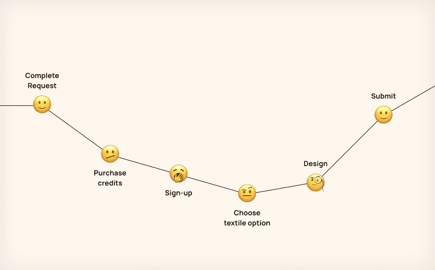
Create™ was launched as an MVP with an invite-only, subscription-based sign-up. However, rising user demand made this onboarding flow slow and overwhelming, reducing engagement rapidly and requiring significant internal effort during the consideration phase to retain these users.

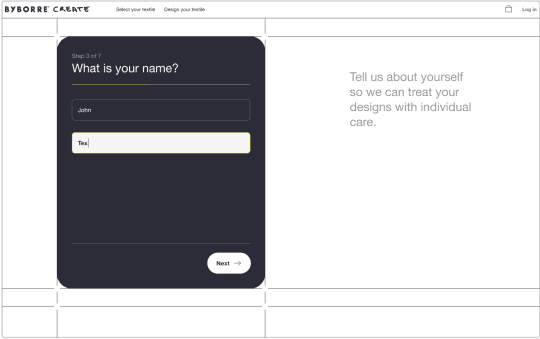
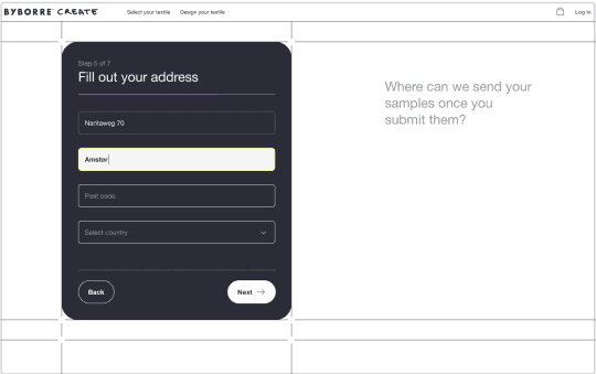
The onboarding flow was long and overlapped with the consideration phase, requiring users to choose a subscription plan, learn the app, and make multiple decisions that required attention.
To address this, the customer success team was structured to assist users in getting started. However, this created user dependency in the customer support team, contributing again to a long journey.
main HYPOTHESIS


Our users were not familiar with a credit-based flow, which increased the likelihood of needing customer support.
The market was predominantly eCommerce-driven, with even the few custom textile solutions leaning toward an eCommerce model.
The design experience, centered around comprehensive customization, had a steep learning curve—something we addressed with the UI revamp of the editor (project coming soon).
DISCOVERING THE PROBLEM(S)


One thing was clear: payment and sign-up were the biggest bottlenecks in this flow. Both require a lot of attention and commitment from users before they even get a chance to explore the product.
Our product is pretty unique in the industry, and the journey to discover it showed to be… well, intricate. But what if we made the experience feel more familiar to the user while bringing our unique value proposition earlier in the journey?
With that in mind, we decided to try a different approach. Following market practices and usability standards, we considered moving payment to the end and streamlined the sign-up flow.
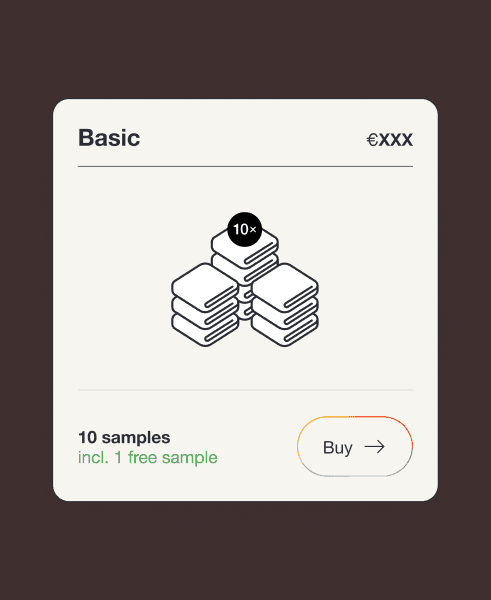
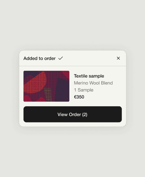
Payment
on the customer side
Sign-up
on the customer side
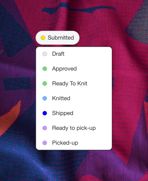
Order Management
in the admin side
Designing in collaboration
Redefining payment with Finance
Changing the payment flow meant rethinking the pricing model—a big shift.
Together with finance, we reworked the pricing so we can remove the credit paywall.
Adjusting operations to new ordering flow
Operations input led to a few changes in our original flow idea:
Custom textiles may need quality control before shipment.
Communication with users needs to be structured.
The shipment process needs to be optimized to ensure we can handle orders efficiently.
Aligning sign-up to (B2B) commercial needs
The previous sign-up flow captured valuable data for the commercial team.
To avoid disruptions, we worked together to map the essential data points needed for segmentation.

Hypothesis
Solution


Hypothesis
Solution


impact
230%
Growth in engagement
(samples created)
100%
Growth in orders
Optimized data tracking
that enabled to develop features based on bigger sets of data.